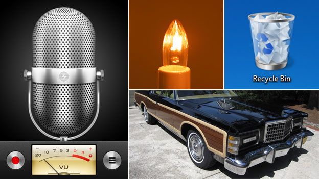
What is skeuomorphism?
- Published

Apple announced it would scrap the "traditional" look of its mobile apps which mimicked real world objects. This is "skeuomorphic" design.
Steve Jobs believed computers should be so simple to use that a complete novice could master them based on instinct alone.
He championed a style of design in which digital elements resembled real world objects that anyone could recognise.
Behind the glass screen lay a "desktop" on which users could arrange "documents", or drop them into the "trash" - an icon in the shape of a bin.
The idea is known as "skeuomorphism". It predates Jobs and persists to this day.
The envelope is the de-facto symbol for email and SMS messages. It offers a nice distinction between read and unread - they become opened and unopened envelopes.
If you're using certain Android Samsung phones your email icon is even more atavistic - an envelope with a red wax seal. But it's got an @ pressed into it - a weird mish-mash of old and new.
On Windows 7, the Sticky Notes program resembles electronic Post-it notes. Write on them and you get a slightly handwriting-esque font called Segoe. Unlike the real thing, they don't lose their stickiness and fall off your desktop.
You cut and paste on Microsoft programs like Word and Outlook using scissors and a clipboard.
The "show desktop" icon on Windows XP looks like a leather-bound desk blotter. Not just an old-world item, but something that hasn't been on the typical desk for a long, long time.
Apple's notepad looks like yellow jotting paper, contacts are stored in a binder, and its golden compass sits on a wooden base.
It's not just the appearance of icons or just the look of an app, some programs like calendars and contacts books actually behave a little bit like their old-world equivalents.
Now, however, all that is set to change. Skeuomorphism has fallen out of favour in recent years, and is almost regarded as a dirty word by many in the design community.
Apple this week announced a radical revision to the approach at its annual developer conference in California and its new mobile operating system will ditch real world visual metaphors in favour of a stripped-back minimalist approach.
"No virtual cows were harmed in the making of this one," quipped Craig Federighi, head of the new project, in deference to the critics of its leather-trimmed calendar app.
The podcast app recently lost its reel-to-reel tape deck look, a reference which would have been lost on many younger smartphone users.
Not everyone will be pleased with the decision though, and some regret the decline of the skeuomorph.
Matt Webb runs BERG, a design company that makes electronic devices incorporating human faces and emotions.
"People that criticise skeuomorphism say it's pointless, but I say it isn't. It increases your understanding of the product. Technology is getting so complicated that we're going to have to find ways for people to understand what it can do without having to spell it out," he says.
Michael Stocking has worked in the industry since the early 90s, and explains how the style has often been misused. Back then, his boss drove an Aston Martin, and insisted that the some of the software resembled the interior of his car - complete with steering wheel, indicators, and a walnut dashboard.
"It was a ludicrous forced metaphor," Stocking says. "Slavishly following real world examples can often be a lazy solution."
Likening on-screen applications to physical counterparts can help initiate the uneducated, but today they can seem unnecessary and outmoded, he suggests.
"We've moved past the need we had for them in the early days. Maybe we've even moved beyond our enjoyment of them."
The word has only been used in the tech industry for a few years, where its meaning has changed, says Dan O'Hara, an academic at Birmingham City University.
"Skeuomorphs are not strictly something that can be designed," he says. "They occur unintentionally when aesthetic styles are inherited without thinking."
Motors were originally placed at the front of cars because horses pulled carts from the front, he says. The word "horsepower" is itself a skeuomorph, remaining long after the horses had disappeared.
Webb wants the skeuomorph revived, and sees their fall from grace as a matter of taste and fashion. If we are going to move away from the tried and tested designs, we should at least take risks and experiment with new ideas, he says.
"Smartphones look like po-faced black monoliths. Why not have something which looks a bit more fun, and more joyful?"
Stocking says he has learned from the example of the Aston Martin and today he advocates a subtler, more purposeful, use of skeuomorphic design. Apple's big shift towards a flatter, sparser design doesn't spark his curiosity.
"Is there no room for ornamentation, for playfulness, for beauty? Are we all going to live in a minimalist world and walk around wearing grey polo necks?" he says.