Airbnb's new logo faces social media backlash
- Published

Airbnb's logo change is facing a backlash on social media, with many commentators suggesting it looks like sexual organs and other parts of the human body.
Others, however, have praised the US home-rental service's new look.
But criticism that the logo had been "stolen" from another tech firm, Automation Anywhere, appears to be misplaced.
Airbnb said the two had come to an agreement before the announcement.
"In early 2014 both Airbnb and Automation Anywhere began use of new logos that, by coincidence, have similar designs," a spokesman told the BBC.
"Airbnb and Automation Anywhere are working cooperatively to address this issue, and Automation Anywhere is in the process of transitioning to a new logo design that is not similar to the Airbnb logo."

The rebrand was carried out by the London-based firm DesignStudio.
Ben Wright, its founder, said seven members of his team had worked on the rebrand over the course of a year.
He said they had not been aware of Automation Anywhere's logo, nor had they recognised their design's sexual connotations.
"We weren't aware to be honest," he told the BBC.
"In the grand scheme of things, it doesn't really bother us too much what people are saying about it.
"People around the world are reacting to this and a small percentage of those people are choosing to read into the logo how they want."
'Make it your own'
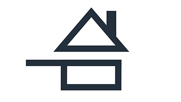
Airbnb calls its new logo Belo, saying it represents "the universal symbol of belonging".
"It's a symbol for going where the locals go - the cafe that doesn't bother with a menu, the dance club hidden down a long alleyway, the art galleries that don't show up in the guidebooks," it said on Wednesday.
"It's a symbol for people who want to welcome into their home new experiences, new cultures, and new conversations."
The firm added that it wanted the public to take Belo and "make your own unique symbol".
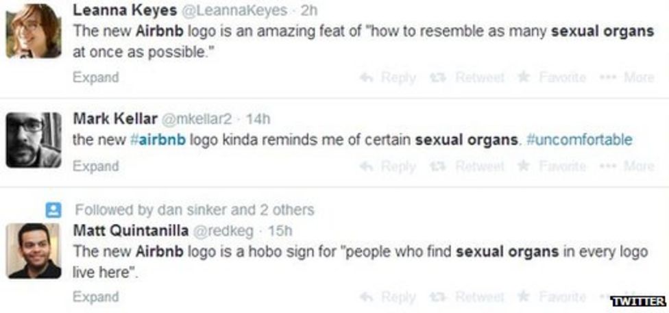
It did not take long for social media users to comment that the logo looked like various body parts, and several then created pornographic drawings that incorporated the design. A Tumblr blog has since gathered many of them together.
Meanwhile, commentators on the firm's official Facebook and Google+ pages were split about the new look.
"Boring ,dull and nothing to do with staying anywhere, what does it represent - I think you should go back to your old logo and then have a rethink," wrote Anna Arnott.

But Brisbane-based user Simon Phillips wrote: "Personally I kinda like it - nice bit of design, identity and positioning for the future."
On Twitter the mocking continued, with Belo being compared to a bottom, testicles and a squished clothes hanger.
A fake account was created and used to tweet off-message thoughts.

While others adapted the design to create animal-themed drawings.


Despite the criticism and jokes, Mr Wright said he and his team still believed it was a good idea to ask the public to adapt the logo, noting that it was the top trending item on Twitter for a time.
"It think it has a synergy and represents Airbnb itself," he explained.
"They're an incredibly brave company - they are going through a lot of problems in places like New York, but ultimately what they are about is their community and they have complete and utter respect for their community.
"So, it felt completely natural and right that the brand should engage with their community and give them ownership.
"Yes, you could say there was a risk element in there, but ultimately the reaction from the community has been great."
Another branding expert, not involved in the campaign, also defended the design.
"Apparently, some people are saying it looks like genitalia. I'm not sure I agree," said Hector Pottie, associate partner at brand consultancy Prophet.
"Not any I've seen anyway.
"The overall identity refresh is strong as well. Building on the spirit of Airbnb that already exists. All in all I think the designers got it spot on."
- Published16 July 2014
- Published19 September 2013
- Published12 October 2010
