BBC Sport new logo and graphics
Colin Burns
Chief Design Officer, Design & Engineering
If you’ve visited the BBC Sport website today, you’ll have noticed a few changes as a new brand identity made its debut for the start of the football season, with the roll-out of a new logo and graphics.
This is the first update of BBC Sport brand guidelines in seven years and the work was commissioned to reflect the significant changes in audiences’ consumption of BBC Sport content across TV and digital platforms.
In order to create a more uniform approach across TV and digital platforms, the changes see the familiar BBC Sport yellow updated alongside a new font which has been developed for the entire BBC portfolio.
From today, visitors to the BBC Sport website will be met with the new design. The first TV programme with the new look will be Football Focus, on Saturday 12 at midday on BBC One, followed by Final Score and Match of the Day later in the evening.
The rebrand will then be rolled out across all BBC Sport output, including TV coverage of the athletics from 19 August, PDC darts from 16 September and cycling from 17 September.
The font is called BBC Reith, named after the BBC’s founder Lord Reith, and as well as making our text and branding clearer it will also save the BBC money.
The existing fonts that the BBC uses were developed last century and work well in print - but they’re not always clear enough when they appear in small, digital, spaces, and we’re all reading and watching far more on screens and mobiles these days.
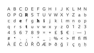
So the new font - which we’ll gradually roll out, starting with sport today - will be easier to read and clearer, especially on small devices.
We also expect it to save us a significant amount of money. We have to pay for licences to use other fonts at the moment, but we won’t have to do this for BBC Reith - so it’s better value as well.
The work on the font has been led by the BBC’s User Experience & Design and Marketing & Audiences teams.
Over time, the new font will start to be used right across the BBC (though the bbc blocks logo itself won't change) and all our broadcast and online output.
We’ll be doing this gradually. Where there is little cost to make the change - such as text on our website - we’ll do it as soon as we can. But we’ll only replace things like signs when they’re worn out or need replacing anyway to avoid extra costs.
We hope you like the changes.
Colin Burns is Chief Design Officer, Design & Engineering