Gap scraps new logo after online outcry
- Published

US clothes retailer Gap has scrapped a new logo just one week after its introduction following an "outpouring of comments" online.
The original logo, which has been used for more than 20 years, has a blue box with "GAP" written in white inside.
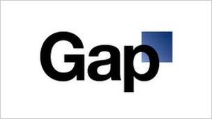
The new logo on the website had "Gap" written in black against a light background with a small blue square behind the top of the letter "p".
But critics attacked the rebranding on social networks and online forums.
More than 2,000 comments were posted on the company's Facebook page on the issue, with many demanding the return of the traditional logo.
In a statement released on the Gap website, Marka Hansen, president of Gap Brand North America, said the company's customers always came first.
"We've been listening to and watching all of the comments this past week. We heard them say over and over again they are passionate about our blue box logo, and they want it back.
"So we've made the decision to do just that - we will bring it back across all channels."
She added that it was clear the retailer "did not go about this in the right way" and "missed the opportunity to engage with the online community".
"There may be a time to evolve our logo, but if and when that time comes, we'll handle it in a different way," she said.
- Published12 October 2010
- Published3 October 2010