Coronavirus: Behind the rise in cases in five charts
- Published
- comments

Officials are alarmed by the latest rise in coronavirus cases. Newly diagnosed cases have topped 2,000 for the past three days.
The average rate of new infections is now four times higher than it was in mid-July. The rise is real, but is it quite as sharp as it looks? Here are five things to consider.
1. The 'peak' was a massive underestimate
The confirmed cases chart is one we have all got used to. It shows the number of positive Covid-19 tests a day. In April, there were days when 6,000 new cases a day were recorded, so the level of infections in the past few days appears to be some way towards that peak.
But at the start of the pandemic, the UK was only largely able to test hospital patients. There was limited testing capacity.
This targeted testing meant infections in the community were completely missed, whereas now we have mass testing in the community. It means that if we compare numbers now to numbers during the peak, we are essentially comparing apples with pears.
Estimates from the London School of Hygiene and Tropical Medicine suggest there may have been as many as 100,000 cases a day at the end of March. Mass testing in the community only started in the second half of May.
Clearly not all cases are now being picked up, although the surveillance programme run by the Office for National Statistics suggests a large proportion are, whereas earlier in the pandemic maybe only 5% of cases were being detected.
So while cases may be rising, the level of infection being seen is still very low compared with the peak.
2. Extra testing is a factor
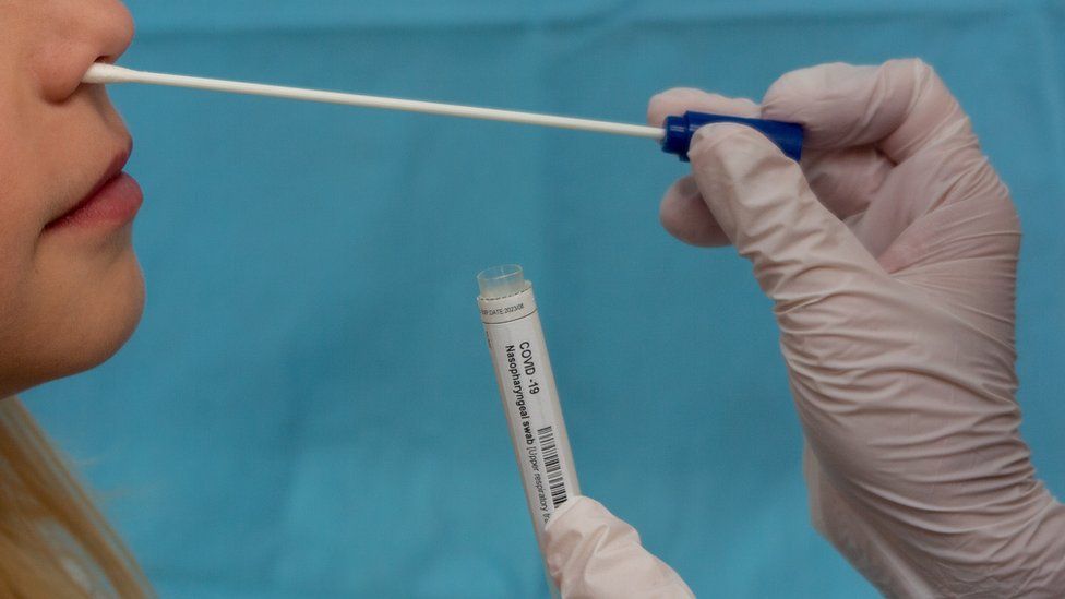
Even after mass testing was launched, the number of tests carried out on a daily and weekly basis has still been increasing.
This is because more testing centres have opened and lab capacity to process the tests has increased. It means we are able to look more closely for virus circulating in the community than we were when mass testing first started.
If you look at the trend solely in terms of positive cases, the pattern looks like this:
But we have to factor in that big increase in testing - there has been an 80% rise since mid-June. When you adjust for the numbers of tests carried out and calculate the percentage of positive tests, the trend looks more like this:
The rise seems to be smaller, slower and to have happened more recently.
3. Testing is targeted at hotspots
The increase in testing capacity means the government now has a flexible army of testing facilities. A network of more than 100 mobile units can be dispatched around the country.
And despite the current problems with lab capacity, which have meant some people in some places have struggled to get a test, resources are still being focused on areas with the highest rates.
Random testing in neighbourhoods has also started in hotspot areas, with people offered tests even if they don't have symptoms.
By looking in areas with highest rates of infection, you are more likely to get positive tests.
It is telling that over the past week to Sunday, a quarter of new cases were in the 20 local authority areas with the highest rates. They represent just 5% of total local authorities.
4. Hospital admissions aren't rising as much as cases
Over the past few days hospital admissions have started to slowly tick up - though not as much as cases, and it's too soon to know if this is statistically significant.
They are a small fraction of the number of admissions back in March, and they are rising much more gradually than they were around the peak.
One theory is that more testing is uncovering a larger number of mild cases which don't need treatment. Another is that more of the cases are among younger people, who are less likely to become very ill.
But the rise suggests the virus could be taking hold in the community again, and could quickly escalate.
5. Young people are testing positive at higher rates
Public Health England data shows people in the 20-39 age bracket are testing positive at higher rates than any other age group, and at higher rates than they were earlier in the pandemic. What's harder to say is why that is.
It could be behavioural or demographic - that younger people are more likely to have to go out to work, have public facing jobs, live in shared housing and go out to socialise.
But it could also be a function of how eligibility for testing has expanded. Younger age groups are much less likely to get seriously sick with coronavirus, and so earlier this year would not have found themselves in hospital where they would have been tested.
- Published3 September 2020
- Published3 May 2022
- Published26 August 2020